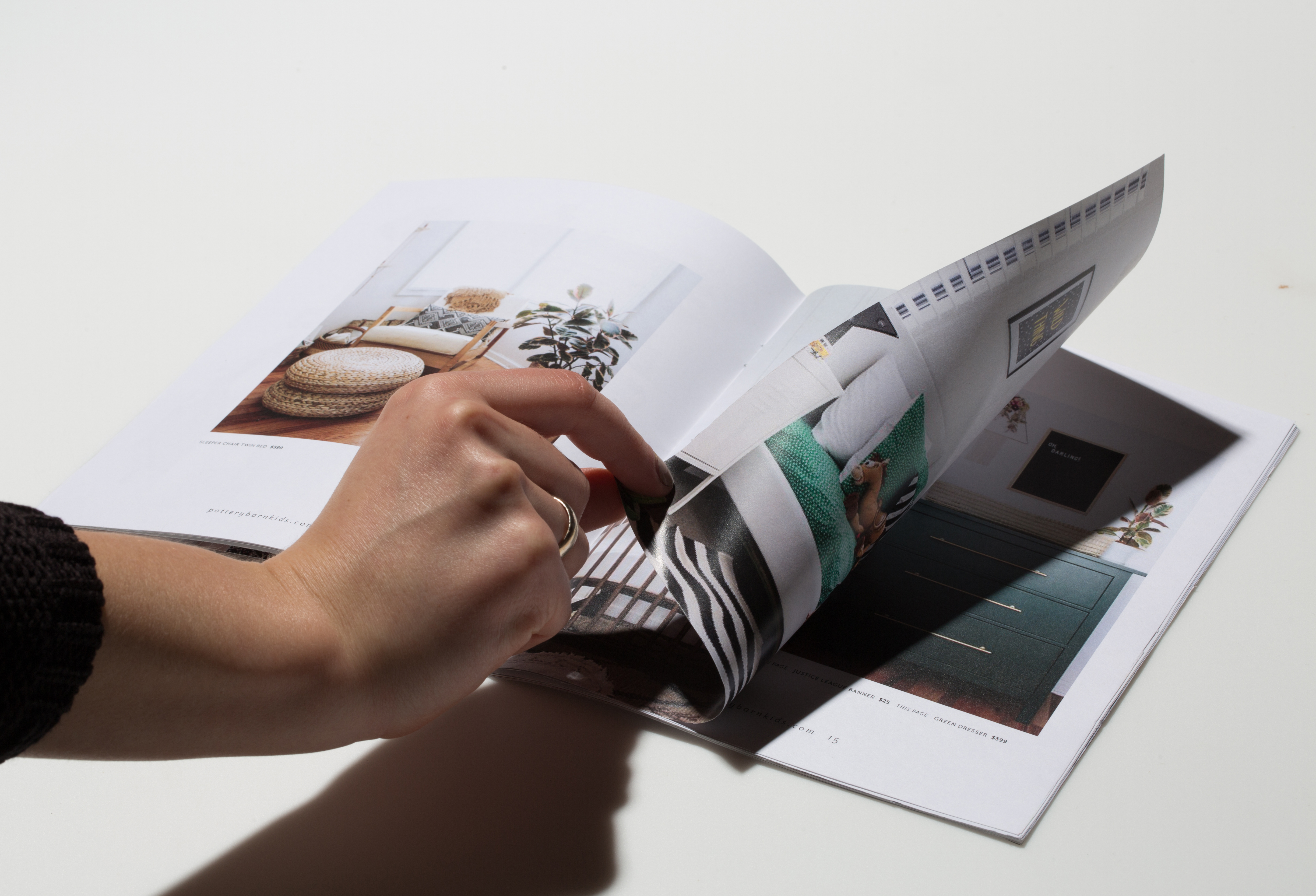
Design Challenge: During my internship at Pottery Barn Kids we created a marketing launch plan for the new Small Spaces line.
Targeted Audience: A millennial customer living in urban environments.
The Solution: I redesigned the Pottery Barn Kids catalog with a modern layout, harvesting negative space and using modern typography. I wanted the catalog to feel like an artifact instead of something to be immediately recycled. The design used an updated photography style that showed spaced more closely related to the types of houses the customer is living in. I created a virtual reality component of the catalog to bring the retail shopping experience into the comfort of the home. I also created presentation graphics when we presented the project to the Pottery Barn Kids leadership.


