Catharine Clark Gallery
Design Challenge: To create unique and creative marketing collateral for the gallery while maintaining but refreshing the brand
Targeted Audience: Collectors, both previous and new, new audience members for the gallery and gallery events
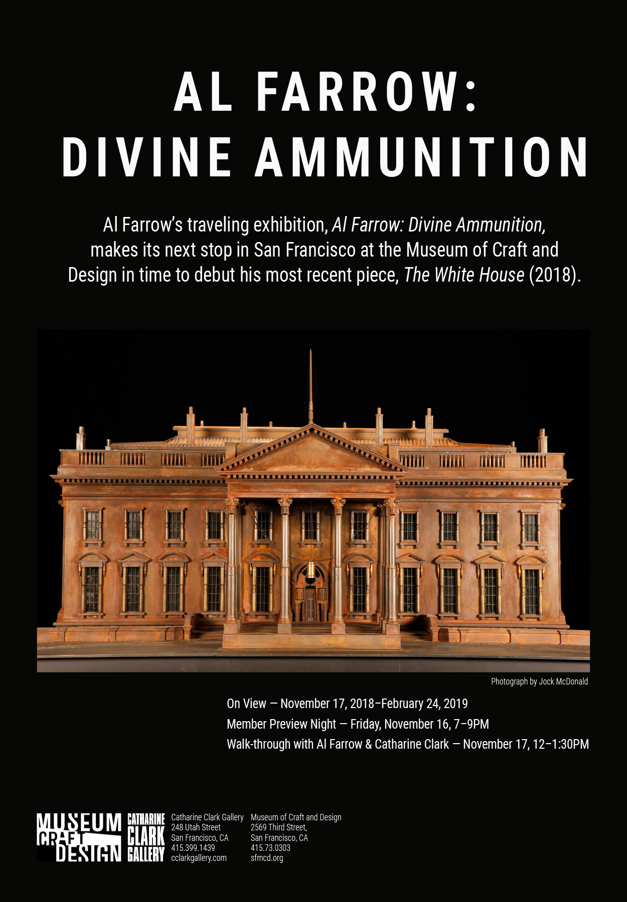
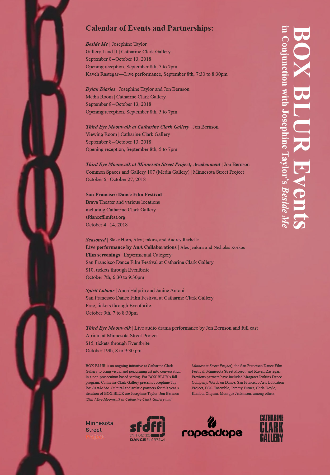
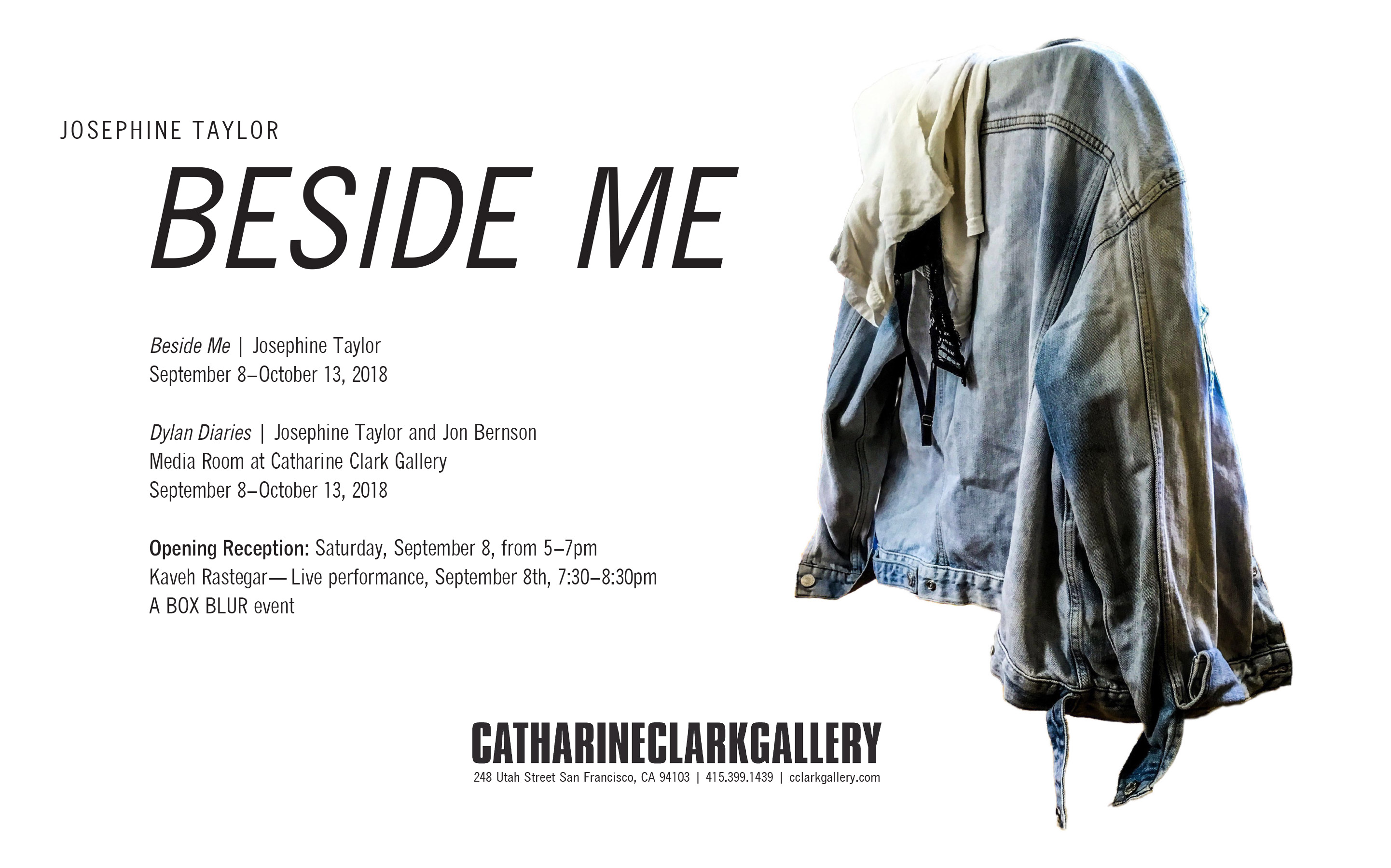
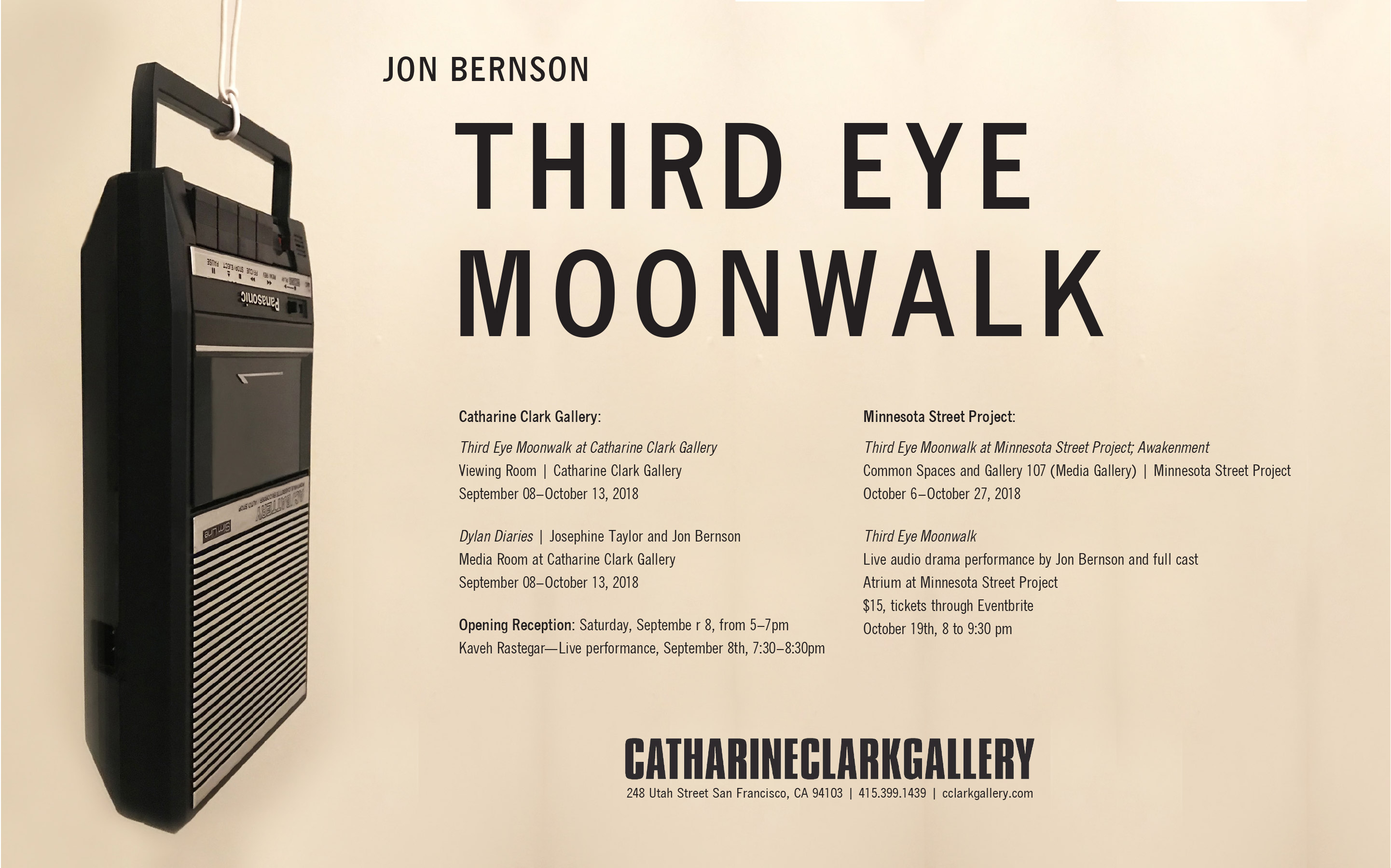
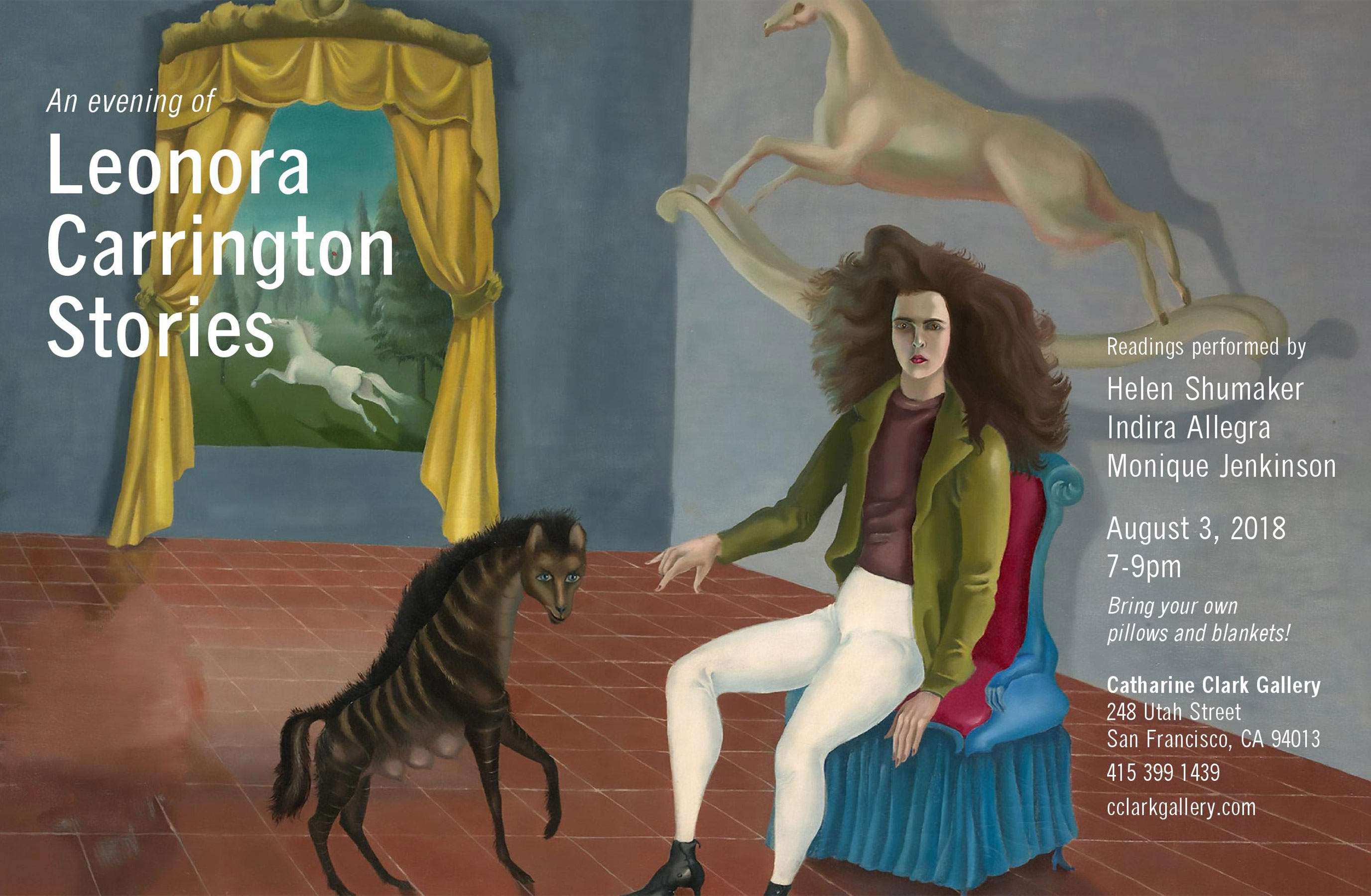
The Solution: Working in the loose guidelines that had been established, I made design choices to elevate the brand without losing its identity, such selecting a new well designed typeface, creating layout standards, and maintaining brand treatment across collateral. I used photography and the work of the artists to enhance marketing materials, making it about the art and promoting the artist’s work.

